Devlog #2 - Text outline, False affordance & Sound test
Cumulative timer
I do love running for short times in some time chasing games, but I often stumble with the problem that players aren't really motivated enough via the game to do this. Leaderboards aren't really enough motivation for me, personally.
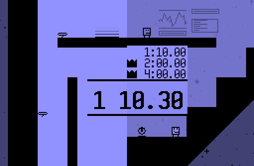
So I've been making a little timer. If you complete the game, each spaceship will get a timer that shows the completion times of all levels on that ship added up. It takes the time of the highest difficulty you've beaten it on, and adds a few minutes penalty if you beat if you beat it on a lower difficulty to give incentive to complete the level on the highest one.
If your time is under a certain par score, you are awarded a medal. And maybe you can also unlock some super secret stuff with medals? That would be really cool, now wouldn't it?
Here's the fastest time I could get on the Arrowhead:
Text outline
Since this game uses both very light and dark background colors, and interface elements in this game are often either partially or entirely transparent, it can be quite difficult to put text on the screen that looks nice with both light and dark backgrounds. This made some text quite hard to read in some circumstances. I already tried things like text shadows and changing the text color depending on the background color, but those were only ban-aid solutions, really.
Then, I got the idea to try text outlines. This is a good way to combat the contrast problem, since if you aren't able to see the outline, you are able to see the text inside it, and vice versa. The problem is that Game Maker doesn't support text outline out of the box, so I made a script that draws the text eight times, each time offsetting it by a single pixel from the origin point on both the x and y axis. It looks strange if used by itself, but by drawing the normal text on top of that, we get the intended effect. It also fits really well with the very little colors that the game uses.
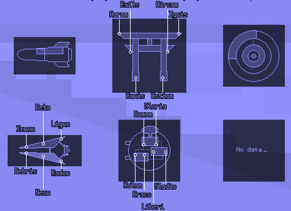
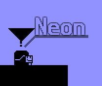
If you put the transparency a bit lower, it also generates a subtile glow effect, which looks really neat on door tags:
Checkpoint
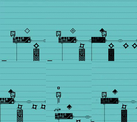
I had one particular playtest where the player avoided the checkpoints. Curiously, I asked why. The conclusion was that they compared them to the circle saws, the main hazard in this game, and saw the (round) checkpoints as a similar obstacle.
For those unfamiliar, this is called a false affordance: basically, it means that an object or function is different that what the player thinks it's intended for. This is because the shape doesn't obviously imply the function, or in this case, the users compare something that they saw earlier. This can create quite troubling situations that can significantly impact player feel: in this case, the player missed the checkpoints, making the game significantly more difficult.
So to make a long story short-- checkpoints are diamond-shaped now. I haven't tested it it solves the issue, but I hope it's better than before. I also added a sound effect that plays when it activates, so now almost every important action in the game has an accompanying sound effect.
Sound Test
So this game does have an original soundtrack, actually! Haven't shown too much of that yet, but I might do that in a later log post. But it's good enough to warrant it's own Sound Test in the game. Here's how it looks:
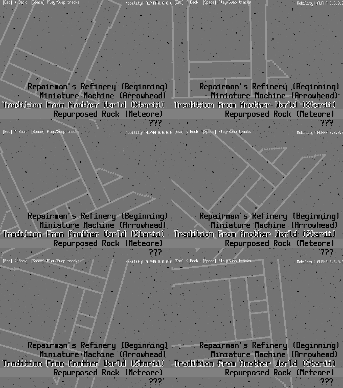
Not sure if I'm overdoing it with the rotating spaceships on the background, but it looks pretty cool.
We're putting together the last spaceship of the game together currently! I bet I'll have some pics for that next time. See ya!
Get Mobility! Accessible precision platformer
Mobility! Accessible precision platformer
Jump, spin and flip to fix broken spaceships! Now including a level editor!
| Status | Released |
| Author | Auroriax (Tom H.) |
| Genre | Platformer |
| Tags | 2D, Funny, GameMaker, jumping, Lo-fi, Minimalist, Singleplayer, Time Attack |
| Languages | English, Dutch |
| Accessibility | Color-blind friendly, Configurable controls, High-contrast, Interactive tutorial |
More posts
- v2.0.0 - The Level Editor is here!Jul 19, 2024
- Level Editor ManualJul 19, 2024
- The 6th anniversary, editor sneak peek!Feb 16, 2024
- Mobility's 5th Anniversary! Announcing... a level editor?! Coming soon!Feb 17, 2023
- Version v1.2.0 - Maintenance UpdateOct 11, 2021
- Small update: 64-bits Linux build & translation sheet publicJan 14, 2020
- Mobility's First Anniversary & v1.1.1 Update!Feb 17, 2019
- Version v1.0.4 - More bug fixesFeb 26, 2018
- Mobility version V1.0.3 - Bug fixesFeb 19, 2018
- Mobility has released! Soundtrack + looking for translatorsFeb 17, 2018
Leave a comment
Log in with itch.io to leave a comment.